📇 本类导航
本页自动汇总「前端」分类下的全部笔记(含子分类),随笔记增删实时更新。
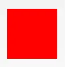
1.正方形
#square {
  width: 100px;
  height: 100px;
  background: red;
}
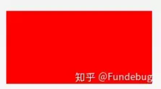
2.长方形
#rectangle {
  width: 200px;
  height: 100px;
  background: red;
}
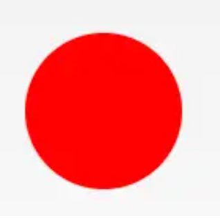
3.圆形
#circle {
  width: 100px;
  height: 100px;
  background: red;
  border-radius: 50%
}
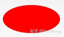
4.椭圆形
#oval {
  width: 200px;
  height: 100px;
  background: red;
  border-radius: 100px / 50px;
}
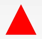
5.上三角
#triangle-up {
  width: 0;
  height: 0;
  border-left: 50px solid transparent;
  border-right: 50px solid transparent;
  border-bottom: 100px solid red;
}
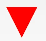
6.下三角
#triangle-down {
  width: 0;
  height: 0;
  border-left: 50px solid transparent;
  border-right: 50px solid transparent;
  border-top: 100px solid red;
}
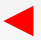
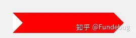
7.左三角
#triangle-left {
  width: 0;
  height: 0;
  border-top: 50px solid transparent;
  border-right: 100px solid red;
  border-bottom: 50px solid transparent;
}
8.右三角
#triangle-right {
  width: 0;
  height: 0;
  border-top: 50px solid transparent;
  border-left: 100px solid red;
  border-bottom: 50px solid transparent;
}
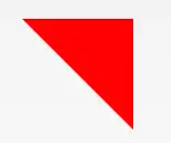
9.左上角
#triangle-topleft {
  width: 0;
  height: 0;
  border-top: 100px solid red;
  border-right: 100px solid transparent;
}
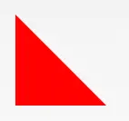
10.右上角
#triangle-topright {
  width: 0;
  height: 0;
  border-top: 100px solid red;
  border-left: 100px solid transparent;
}
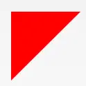
11.左下角
#triangle-bottomleft {
  width: 0;
  height: 0;
  border-bottom: 100px solid red;
  border-right: 100px solid transparent;
}
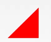
12.右下角
#triangle-bottomright {
  width: 0;
  height: 0;
  border-bottom: 100px solid red;
  border-left: 100px solid transparent;
}
13.箭头
#curvedarrow {
  position: relative;
  width: 0;
  height: 0;
  border-top: 9px solid transparent;
  border-right: 9px solid red;
  transform: rotate(10deg);
}
#curvedarrow:after {
  content: "";
  position: absolute;
  border: 0 solid transparent;
  border-top: 3px solid red;
  border-radius: 20px 0 0 0;
  top: -12px;
  left: -9px;
  width: 12px;
  height: 12px;
  transform: rotate(45deg);
}
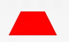
14.梯形
#trapezoid {
  border-bottom: 100px solid red;
  border-left: 25px solid transparent;
  border-right: 25px solid transparent;
  height: 0;
  width: 100px;
}
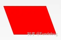
15.平行四边形
#parallelogram {
  width: 150px;
  height: 100px;
  transform: skew(20deg);
  background: red;
}
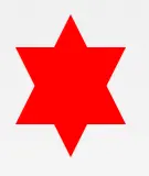
16.星星 (6角)
#star-six {
  width: 0;
  height: 0;
  border-left: 50px solid transparent;
  border-right: 50px solid transparent;
  border-bottom: 100px solid red;
  position: relative;
}
#star-six:after {
  width: 0;
  height: 0;
  border-left: 50px solid transparent;
  border-right: 50px solid transparent;
  border-top: 100px solid red;
  position: absolute;
  content: "";
  top: 30px;
  left: -50px;
}
17.星星 (5角)
#star-five {
  margin: 50px 0;
  position: relative;
  display: block;
  color: red;
  width: 0px;
  height: 0px;
  border-right: 100px solid transparent;
  border-bottom: 70px solid red;
  border-left: 100px solid transparent;
  transform: rotate(35deg);
}
#star-five:before {
  border-bottom: 80px solid red;
  border-left: 30px solid transparent;
  border-right: 30px solid transparent;
  position: absolute;
  height: 0;
  width: 0;
  top: -45px;
  left: -65px;
  display: block;
  content: '';
  transform: rotate(-35deg);
}
#star-five:after {
  position: absolute;
  display: block;
  color: red;
  top: 3px;
  left: -105px;
  width: 0px;
  height: 0px;
  border-right: 100px solid transparent;
  border-bottom: 70px solid red;
  border-left: 100px solid transparent;
  transform: rotate(-70deg);
  content: '';
}
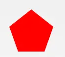
18.五边形
#pentagon {
  position: relative;
  width: 54px;
  box-sizing: content-box;
  border-width: 50px 18px 0;
  border-style: solid;
  border-color: red transparent;
}
#pentagon:before {
  content: "";
  position: absolute;
  height: 0;
  width: 0;
  top: -85px;
  left: -18px;
  border-width: 0 45px 35px;
  border-style: solid;
  border-color: transparent transparent red;
}
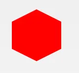
19.六边形
#hexagon {
  width: 100px;
  height: 55px;
  background: red;
  position: relative;
}
#hexagon:before {
  content: "";
  position: absolute;
  top: -25px;
  left: 0;
  width: 0;
  height: 0;
  border-left: 50px solid transparent;
  border-right: 50px solid transparent;
  border-bottom: 25px solid red;
}
#hexagon:after {
  content: "";
  position: absolute;
  bottom: -25px;
  left: 0;
  width: 0;
  height: 0;
  border-left: 50px solid transparent;
  border-right: 50px solid transparent;
  border-top: 25px solid red;
}
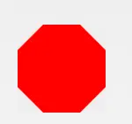
20.八边形
#octagon {
  width: 100px;
  height: 100px;
  background: red;
  position: relative;
}
#octagon:before {
  content: "";
  width: 100px;
  height: 0;
  position: absolute;
  top: 0;
  left: 0;
  border-bottom: 29px solid red;
  border-left: 29px solid #eee;
  border-right: 29px solid #eee;
}
#octagon:after {
  content: "";
  width: 100px;
  height: 0;
  position: absolute;
  bottom: 0;
  left: 0;
  border-top: 29px solid red;
  border-left: 29px solid #eee;
  border-right: 29px solid #eee;
}
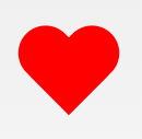
21.爱心
#heart {
  position: relative;
  width: 100px;
  height: 90px;
}
#heart:before,
#heart:after {
  position: absolute;
  content: "";
  left: 50px;
  top: 0;
  width: 50px;
  height: 80px;
  background: red;
  border-radius: 50px 50px 0 0;
  transform: rotate(-45deg);
  transform-origin: 0 100%;
}
#heart:after {
  left: 0;
  transform: rotate(45deg);
  transform-origin: 100% 100%;
}
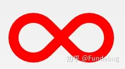
22.无穷大
#infinity {
  position: relative;
  width: 212px;
  height: 100px;
  box-sizing: content-box;
}
#infinity:before,
#infinity:after {
  content: "";
  box-sizing: content-box;
  position: absolute;
  top: 0;
  left: 0;
  width: 60px;
  height: 60px;
  border: 20px solid red;
  border-radius: 50px 50px 0 50px;
  transform: rotate(-45deg);
}
#infinity:after {
  left: auto;
  right: 0;
  border-radius: 50px 50px 50px 0;
  transform: rotate(45deg);
}
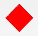
23.菱形
#diamond {
  width: 0;
  height: 0;
  border: 50px solid transparent;
  border-bottom-color: red;
  position: relative;
  top: -50px;
}
#diamond:after {
  content: '';
  position: absolute;
  left: -50px;
  top: 50px;
  width: 0;
  height: 0;
  border: 50px solid transparent;
  border-top-color: red;
}
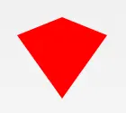
24.钻石1
#diamond-shield {
  width: 0;
  height: 0;
  border: 50px solid transparent;
  border-bottom: 20px solid red;
  position: relative;
  top: -50px;
}
#diamond-shield:after {
  content: '';
  position: absolute;
  left: -50px;
  top: 20px;
  width: 0;
  height: 0;
  border: 50px solid transparent;
  border-top: 70px solid red;
}
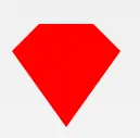
25.钻石2
#cut-diamond {
  border-style: solid;
  border-color: transparent transparent red transparent;
  border-width: 0 25px 25px 25px;
  height: 0;
  width: 50px;
  box-sizing: content-box;
  position: relative;
  margin: 20px 0 50px 0;
}
#cut-diamond:after {
  content: "";
  position: absolute;
  top: 25px;
  left: -25px;
  width: 0;
  height: 0;
  border-style: solid;
  border-color: red transparent transparent transparent;
  border-width: 70px 50px 0 50px;
}
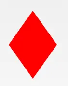
26.钻戒
#diamond-narrow {
  width: 0;
  height: 0;
  border: 50px solid transparent;
  border-bottom: 70px solid red;
  position: relative;
  top: -50px;
}
#diamond-narrow:after {
  content: '';
  position: absolute;
  left: -50px;
  top: 70px;
  width: 0;
  height: 0;
  border: 50px solid transparent;
  border-top: 70px solid red;
}
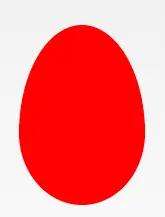
27. 鸡蛋
#egg {
  display: block;
  width: 126px;
  height: 180px;
  background-color: red;
  border-radius: 50% 50% 50% 50% / 60% 60% 40% 40%;
}
28. 吃豆人
#pacman {
  width: 0px;
  height: 0px;
  border-right: 60px solid transparent;
  border-top: 60px solid red;
  border-left: 60px solid red;
  border-bottom: 60px solid red;
  border-top-left-radius: 60px;
  border-top-right-radius: 60px;
  border-bottom-left-radius: 60px;
  border-bottom-right-radius: 60px;
}
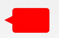
29.对话泡泡
#talkbubble {
  width: 120px;
  height: 80px;
  background: red;
  position: relative;
  -moz-border-radius: 10px;
  -webkit-border-radius: 10px;
  border-radius: 10px;
}
#talkbubble:before {
  content: "";
  position: absolute;
  right: 100%;
  top: 26px;
  width: 0;
  height: 0;
  border-top: 13px solid transparent;
  border-right: 26px solid red;
  border-bottom: 13px solid transparent;
}
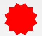
30. 12点 爆发
#burst-12 {
  background: red;
  width: 80px;
  height: 80px;
  position: relative;
  text-align: center;
}
#burst-12:before,
#burst-12:after {
  content: "";
  position: absolute;
  top: 0;
  left: 0;
  height: 80px;
  width: 80px;
  background: red;
}
#burst-12:before {
  transform: rotate(30deg);
}
#burst-12:after {
  transform: rotate(60deg);
}
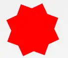
31. 8点 爆发
#burst-8 {
  background: red;
  width: 80px;
  height: 80px;
  position: relative;
  text-align: center;
  transform: rotate(20deg);
}
#burst-8:before {
  content: "";
  position: absolute;
  top: 0;
  left: 0;
  height: 80px;
  width: 80px;
  background: red;
  transform: rotate(135deg);
}
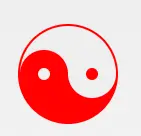
32.太极
#yin-yang {
  width: 96px;
  box-sizing: content-box;
  height: 48px;
  background: #eee;
  border-color: red;
  border-style: solid;
  border-width: 2px 2px 50px 2px;
  border-radius: 100%;
  position: relative;
}
#yin-yang:before {
  content: "";
  position: absolute;
  top: 50%;
  left: 0;
  background: #eee;
  border: 18px solid red;
  border-radius: 100%;
  width: 12px;
  height: 12px;
  box-sizing: content-box;
}
#yin-yang:after {
  content: "";
  position: absolute;
  top: 50%;
  left: 50%;
  background: red;
  border: 18px solid #eee;
  border-radius: 100%;
  width: 12px;
  height: 12px;
  box-sizing: content-box;
}
33.徽章丝带
#badge-ribbon {
  position: relative;
  background: red;
  height: 100px;
  width: 100px;
  border-radius: 50px;
}
#badge-ribbon:before,
#badge-ribbon:after {
  content: '';
  position: absolute;
  border-bottom: 70px solid red;
  border-left: 40px solid transparent;
  border-right: 40px solid transparent;
  top: 70px;
  left: -10px;
  transform: rotate(-140deg);
}
#badge-ribbon:after {
  left: auto;
  right: -10px;
  transform: rotate(140deg);
}
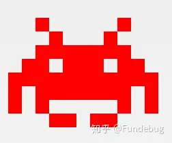
34.太空入侵者(电脑游戏名)
#space-invader {
  box-shadow: 0 0 0 1em red,
  0 1em 0 1em red,
  -2.5em 1.5em 0 .5em red,
  2.5em 1.5em 0 .5em red,
  -3em -3em 0 0 red,
  3em -3em 0 0 red,
  -2em -2em 0 0 red,
  2em -2em 0 0 red,
  -3em -1em 0 0 red,
  -2em -1em 0 0 red,
  2em -1em 0 0 red,
  3em -1em 0 0 red,
  -4em 0 0 0 red,
  -3em 0 0 0 red,
  3em 0 0 0 red,
  4em 0 0 0 red,
  -5em 1em 0 0 red,
  -4em 1em 0 0 red,
  4em 1em 0 0 red,
  5em 1em 0 0 red,
  -5em 2em 0 0 red,
  5em 2em 0 0 red,
  -5em 3em 0 0 red,
  -3em 3em 0 0 red,
  3em 3em 0 0 red,
  5em 3em 0 0 red,
  -2em 4em 0 0 red,
  -1em 4em 0 0 red,
  1em 4em 0 0 red,
  2em 4em 0 0 red;
  background: red;
  width: 1em;
  height: 1em;
  overflow: hidden;
  margin: 50px 0 70px 65px;
}
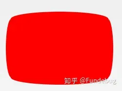
35.电视
#tv {
  position: relative;
  width: 200px;
  height: 150px;
  margin: 20px 0;
  background: red;
  border-radius: 50% / 10%;
  color: white;
  text-align: center;
  text-indent: .1em;
}
#tv:before {
  content: '';
  position: absolute;
  top: 10%;
  bottom: 10%;
  right: -5%;
  left: -5%;
  background: inherit;
  border-radius: 5% / 50%;
}
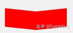
36.雪佛龙
#chevron {
  position: relative;
  text-align: center;
  padding: 12px;
  margin-bottom: 6px;
  height: 60px;
  width: 200px;
}
#chevron:before {
  content: '';
  position: absolute;
  top: 0;
  left: 0;
  height: 100%;
  width: 51%;
  background: red;
  transform: skew(0deg, 6deg);
}
#chevron:after {
  content: '';
  position: absolute;
  top: 0;
  right: 0;
  height: 100%;
  width: 50%;
  background: red;
  transform: skew(0deg, -6deg);
}
37.放大镜
#magnifying-glass {
  font-size: 10em;
  display: inline-block;
  width: 0.4em;
  box-sizing: content-box;
  height: 0.4em
  border: 0.1em solid red;
  position: relative;
  border-radius: 0.35em;
}
#magnifying-glass:before {
  content: "";
  display: inline-block;
  position: absolute;
  right: -0.25em;
  bottom: -0.1em;
  border-width: 0;
  background: red;
  width: 0.35em;
  height: 0.08em;
  transform: rotate(45deg);
}
38.Facebook图标
#facebook-icon {
  background: red;
  text-indent: -999em;
  width: 100px;
  height: 110px;
  box-sizing: content-box;
  border-radius: 5px;
  position: relative;
  overflow: hidden;
  border: 15px solid red;
  border-bottom: 0;
}
#facebook-icon:before {
  content: "/20";
  position: absolute;
  background: red;
  width: 40px;
  height: 90px;
  bottom: -30px;
  right: -37px;
  border: 20px solid #eee;
  border-radius: 25px;
  box-sizing: content-box;
}
#facebook-icon:after {
  content: "/20";
  position: absolute;
  width: 55px;
  top: 50px;
  height: 20px;
  background: #eee;
  right: 5px;
  box-sizing: content-box;
}
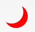
39.月亮
#moon {
  width: 80px;
  height: 80px;
  border-radius: 50%;
  box-shadow: 15px 15px 0 0 red;
}
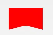
40.旗
#flag {
  width: 110px;
  height: 56px;
  box-sizing: content-box;
  padding-top: 15px;
  position: relative;
  background: red;
  color: white;
  font-size: 11px;
  letter-spacing: 0.2em;
  text-align: center;
  text-transform: uppercase;
}
#flag:after {
  content: "";
  position: absolute;
  left: 0;
  bottom: 0;
  width: 0;
  height: 0;
  border-bottom: 13px solid #eee;
  border-left: 55px solid transparent;
  border-right: 55px solid transparent;
}
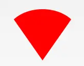
41.圆锥
 #cone {
  width: 0;
  height: 0;
  border-left: 70px solid transparent;
  border-right: 70px solid transparent;
  border-top: 100px solid red;
  border-radius: 50%;
}
42.十字架
#cross {
  background: red;
  height: 100px;
  position: relative;
  width: 20px;
}
#cross:after {
  background: red;
  content: "";
  height: 20px;
  left: -40px;
  position: absolute;
  top: 40px;
  width: 100px;
}
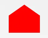
43.根基
#base {
  background: red;
  display: inline-block;
  height: 55px;
  margin-left: 20px;
  margin-top: 55px;
  position: relative;
  width: 100px;
}
#base:before {
  border-bottom: 35px solid red;
  border-left: 50px solid transparent;
  border-right: 50px solid transparent;
  content: "";
  height: 0;
  left: 0;
  position: absolute;
  top: -35px;
  width: 0;
}
44.指示器
#pointer {
  width: 200px;
  height: 40px;
  position: relative;
  background: red;
}
#pointer:after {
  content: "";
  position: absolute;
  left: 0;
  bottom: 0;
  width: 0;
  height: 0;
  border-left: 20px solid white;
  border-top: 20px solid transparent;
  border-bottom: 20px solid transparent;
}
#pointer:before {
  content: "";
  position: absolute;
  right: -20px;
  bottom: 0;
  width: 0;
  height: 0;
  border-left: 20px solid red;
  border-top: 20px solid transparent;
  border-bottom: 20px solid transparent;
}
45.锁
#lock {
  font-size: 8px;
  position: relative;
  width: 18em;
  height: 13em;
  border-radius: 2em;
  top: 10em;
  box-sizing: border-box;
  border: 3.5em solid red;
  border-right-width: 7.5em;
  border-left-width: 7.5em;
  margin: 0 0 6rem 0;
}
#lock:before {
  content: "";
  box-sizing: border-box;
  position: absolute;
  border: 2.5em solid red;
  width: 14em;
  height: 12em;
  left: 50%;
  margin-left: -7em;
  top: -12em;
  border-top-left-radius: 7em;
  border-top-right-radius: 7em;
}
#lock:after {
  content: "";
  box-sizing: border-box;
  position: absolute;
  border: 1em solid red;
  width: 5em;
  height: 8em;
  border-radius: 2.5em;
  left: 50%;
  top: -1em;
  margin-left: -2.5em;
}









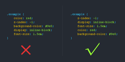
1.位置属性(position, top, right, z-index, display, float等)
2.大小(width, height, padding, margin)
3.文字系列(font, line-height, letter-spacing, color- text-align等)
4.背景(background, border等)
5.其他(animation, transition等)
CSS书写规范
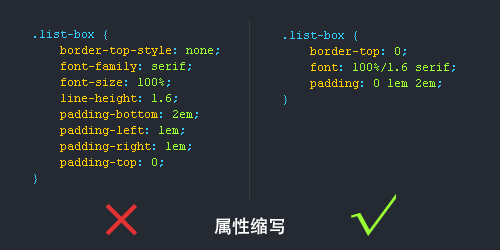
使用CSS缩写属性
CSS有些属性是可以缩写的,比如padding,margin,font等等,这样精简代码同时又能提高用户的阅读体验。
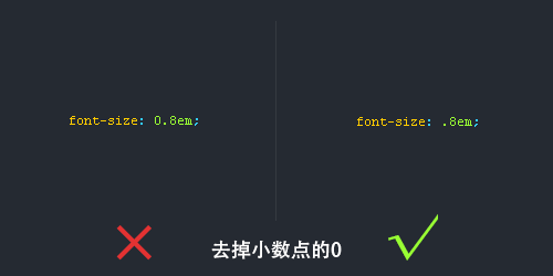
去掉小数点前的“0”
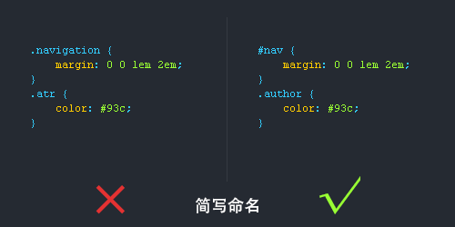
简写命名
很多用户都喜欢简写类名,但前提是要让人看懂你的命名才能简写哦!
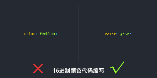
16进制颜色代码缩写
有些颜色代码是可以缩写的,我们就尽量缩写吧,提高用户体验为主。
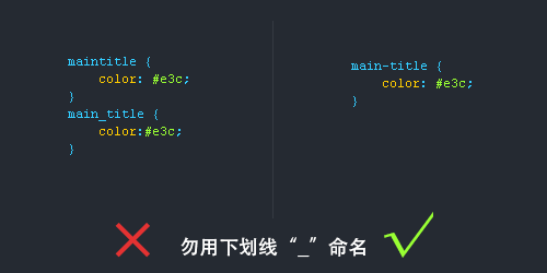
连字符CSS选择器命名规范
1.长名称或词组可以使用中横线来为选择器命名。
2.不建议使用“_”下划线来命名CSS选择器,为什么呢?
- 输入的时候少按一个shift键;
- 浏览器兼容问题 (比如使用_tips的选择器命名,在IE6是无效的)
- 能良好区分JavaScript变量命名(JS变量命名是用“_”)
不要随意使用id
**id在JS是唯一的,不能多次使用,而使用class类选择器却可以重复使用,另外id的优先级优先与class,所以id应该按需使用,而不能滥用。**  --- ## 为选择器添加状态前缀 **有时候可以给选择器添加一个表示状态的前缀,让语义更明了,比如下图是添加了“.is-”前缀。**  --- # CSS命名规范(规则)常用的CSS命名规则
头:header
内容:content/container
尾:footer
导航:nav
侧栏:sidebar
栏目:column
页面外围控制整体佈局宽度:wrapper
左右中:left right center
登录条:loginbar
标志:logo
广告:banner
页面主体:main
热点:hot
新闻:news
下载:download
子导航:subnav
菜单:menu
子菜单:submenu
搜索:search
友情链接:friendlink
页脚:footer
版权:copyright
滚动:scroll
内容:content
标签:tags
文章列表:list
提示信息:msg
小技巧:tips
栏目标题:title
加入:joinus
指南:guide
服务:service
注册:regsiter
状态:status
投票:vote
合作伙伴:partner注释的写法:
/ Header /
内容区
/ End Header /id的命名:
(1)页面结构
容器: container
页头:header
内容:content/container
页面主体:main
页尾:footer
导航:nav
侧栏:sidebar
栏目:column
页面外围控制整体佈局宽度:wrapper
左右中:left right center
(2)导航
导航:nav
主导航:mainnav
子导航:subnav
顶导航:topnav
边导航:sidebar
左导航:leftsidebar
右导航:rightsidebar
菜单:menu
子菜单:submenu
标题: title
摘要: summary
(3)功能
标志:logo
广告:banner
登陆:login
登录条:loginbar
注册:register
搜索:search
功能区:shop
标题:title
加入:joinus
状态:status
按钮:btn
滚动:scroll
标籤页:tab
文章列表:list
提示信息:msg
当前的: current
小技巧:tips
图标: icon
注释:note
指南:guild
服务:service
热点:hot
新闻:news
下载:download
投票:vote
合作伙伴:partner
友情链接:link
版权:copyright
注意事项
**1.一律小写;** **2.尽量用英文;** **3.不加中槓和下划线;** **4.尽量不缩写,除非一看就明白的单词。** --- ## CSS样式表文件命名 **主要的 master.css** **模块 module.css** **基本共用 base.css** **布局、版面 layout.css** **主题 themes.css** **专栏 columns.css** **文字 font.css** **表单 forms.css** **补丁 mend.css**
""(空字符串)
NaN
400 - 前端传过来的参数错误,可能是数据格式,可能是写的名字映射不上,反正就是打不成一个对象发过来,一定要和后端的数据包格式要对上(错了好多次400这里)
401 - 权限不足
500 - 后台系统有错误,后端哪里的代码抛异常了
600 - 其他业务异常
200 - 成功
before和after的理解
其实就是一个行内元素,只不过一个在元素前触发,一个后触发罢了
选择器
>:父子
+:兄弟
section [class^=“box”]:section元素中所有以box为前缀的元素
通配样式
*{
    margin: 0;
    padding:0;
    font-size: 14px;
    font-family: Arial, Helvetica, sans-serif;
    box-sizing: border-box;
    list-style: none; /*隐藏无序列表的表头 */
}
calc函数使用
width: calc(100% / 2 - 5px);文字超出容器宽度自动换行
overflow-wrap: break-word;文字超出内容省略显示
text-overflow: ellipsis;calc函数使用
width: calc(100% / 2 - 5px);隐藏元素
    visibility: hidden;  /* 隐藏元素 */
overflow: hidden;  /* 隐藏内容溢出部分 */
使容器在屏幕居中(放容器中)
    /* 使容器居中 */
    top: 0;
    left: 0;
    right: 0;
    bottom: 0;
    margin: auto;
一些经验:
行内块标签(inline-block ******)与行内标签(**inline)的最大区别就是可以设置宽高,其他的和行内标签没区别
行内标签的宽度受本身元素内容的影响,如果想去除掉这个影响,可以用 display:inline-block,转成行内块形式
==当绝对位置也达不到想要的效果时,这时候用 transform 平移一下即可==
想要几个组件并排放置,可以使用浮动布局,float:left,同时需要设置一下width,不然就只会显示容器里面最大组件的宽度
background的值里面一定要给no-repeat,background-image就不需要
border-radius的起始点是左上角
使用浮动框架时,记住一个理念即可:先确定高度,再平均分配宽度
div标签里面设置文本居中,text-align: center;
怪异盒子模型其实就是计算高度和宽度时和普通盒子模型不一样而已,就这么简单,box-sizing: boder-box;
W3C:标准width: border+padding+content IE:怪异width:width
一、插件
① HTML CSS Support
② Live Preview:实时查看页面渲染
③ Auto Rename Tag:可以让你在修改html标签的时候,同步修改另一个标签
二、标签
和标签:通常用于创建块级容器,以便于组织页面的结构和布局:用于内联样式化文本,给一部分文本赋上样
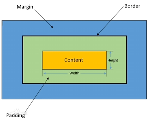
三、盒子模型
示例图如下所示:
复合样式时,哪边没有就找他对面的有没有四、浮动 **(**float )
特点:用于创建浮动框,将其移动到一边,直到左边缘或右边缘触及包含块或另一个浮动框的边缘,这样即可使得元素进行浮动。
父元素高度出现塌陷:
# 父元素样式中加入以下代码
overflow: hidden;
五、定位(position)
特点:定位布局可以精准定位,但缺乏灵活性
定位方式:
==占据文档流==
- 相对定位:相对于元素在文档流中的正常位置进行定位。
==不占据文档流==- 绝对定位 :相对于其最近的已定位祖先元素进行定位。
- 固定定位 :相对于浏览器窗口进行定位。固定在屏幕上的位置,不随滚动而移动。
六、flex弹性盒子
说明:在容器里面布局的一种方式
使用
/* 父盒子 */
display: flex;
flex-direction: 【排列方式】;
/* x方向对齐方式 */
justify-content:【对齐方式】;
/* y方向对齐方式 */
align-items:【对齐方式】;
七、CSS 样式优先级
- 通配符:0***** .
- 标签选择器:1**** . 如:p,h3,h2。
- 类选择器:10**** .
- ID选择器:100**** .
- **!important:** +无穷大 .
- *!important>ID选择器>类选择器>标签选择器>*通配符
红心
   <div id="heart"></div>

#heart {
        position: relative;
        width: 100px;
        height: 90px;
    }
    #heart:before,
    #heart:after {
        position: absolute;
        content: "";
        left: 50px;
        top: 0;
        width: 50px;
        height: 80px;
        background: red;
        border-radius: 50px 50px 0 0;
        transform: rotate(-45deg);
        transform-origin: 0 100%;
    }
    #heart:after {
        left: 0;
        transform: rotate(45deg);
        transform-origin: 100% 100%;
    }
方块
    <div class="diamond_wrapper">
        <div class="diamond"></div>
    </div>

.diamond_wrapper {
        position: absolute;
        top: 100px;
        left: 100px;
    }
    .diamond {
        width: 0;
        height: 0;
        border: 50px solid transparent;
        border-bottom: 90px solid red;
        position: relative;
    }
    .diamond::after {
        content: "";
        position: absolute;
        left: -50px;
        top: 90px;
        width: 0;
        height: 0;
        border: 50px solid transparent;
        border-top: 90px solid red;
    }
黑桃
    <span class="heart-heitao">
        <span class="tale"></span>
    </span>

/* 1  先画一个正方形 */
    .heitao {
        width: 30px;
        height: 30px;
        transform: rotate(135deg);
        background-color: black;
        display: inline-block;
        margin: 0 10px;
        position: relative;
    }
    /* 2 画两个偏移的圆 通过伪元素创建 */
    .heitao:before,
    .heitao:after {
        content: "";
        border-radius: 50%;
        height: 30px;
        width: 30px;
        background: black;
        position: absolute;
    }
    .heitao:before {
        top: -15px;
        left: 0;
    }
    .heitao:after {
        left: 15px;
        top: 0;
    }
    /* 3 画小尾巴 通过border创建 */
    .tale {
        position: absolute;
        bottom: 20px;
        right: -3px;
        background: transparent;
        width: 0;
        height: 0;
        border-left: 4px solid transparent;
        border-right: 4px solid transparent;
        border-top: 20px solid black;
        transform: rotate(45deg);
    }
梅花
<div class="circle"></div> <div class="triangle"></div> <div class="base"></div> /* 外层容器 */ .circle { width: 100px; height: 100px; background: red; border-radius: 50px; position: absolute; left: 63px; z-index: 100; } .circle:before { content: ""; width: 100px; height: 100px; background: red; border-radius: 50px; position: absolute; left: -60px; top: 80px; z-index: 100; } .circle:after { content: ""; width: 100px; height: 100px; background: red; border-radius: 50px; position: absolute; left: 60px; top: 80px; z-index: 100; } .triangle { width: 0; height: 0; border-left: 75px solid transparent; border-right: 75px solid transparent; border-bottom: 105px solid transparent; position: absolute; top: 40px; left: 38px; z-index: 100; } .base { background: none repeat scroll 0 0 yellow; height: 70px; position: absolute; left: 0; top: 140px; width: 200px; z-index: 0; } .base::before { width: 0px; height: 10px; position: absolute; left: 0; content: ""; border-left: 50px solid white; border-right: 50px solid white; border-top: 10px solid white; border-bottom: 50px solid white; border-top-left-radius: 0px; border-top-right-radius: 0px; border-bottom-left-radius: 0px; border-bottom-right-radius: 60px; } .base::after { width: 0px; height: 10px; position: absolute; left: 125px; content: ""; border-left: 50px solid white; border-right: 50px solid white; border-top: 10px solid white; border-bottom: 50px solid white; border-top-left-radius: 0px; border-top-right-radius: 0px; border-bottom-left-radius: 60px; border-bottom-right-radius: 0px; }All articles on this blog are licensed under CC BY-NC-SA 4.0 unless otherwise stated.Comments